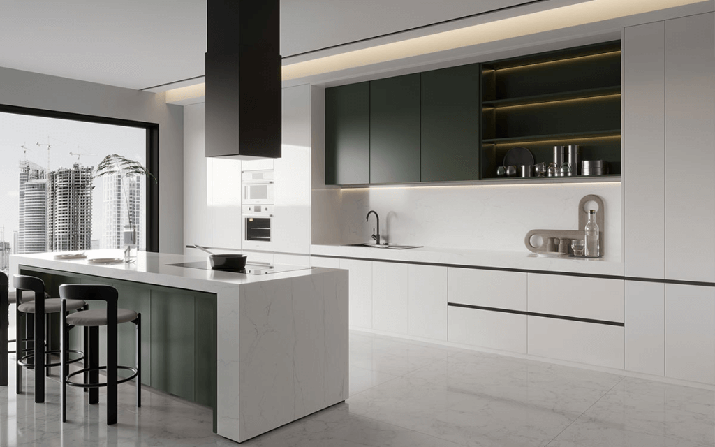
Small Kitchen Two-Tone Layouts: Can Two Colors Really Make Your Space Feel Larger?
Can two-tone colors really make a small kitchen feel bigger? Discover smart visual tricks, layout tips, and color pairings to open up your compact space.
Why Two-Tone Works Wonders in Small Kitchens
Monochrome kitchens can feel flat or boxy in a small space. Two-tone layouts, however, create depth and movement. When done correctly, they trick the eye into seeing more square footage than actually exists. Dark colors recede, light colors advance, and contrasting tones define different zones. This visual layering gives your brain the impression of a larger, more structured room. Simply put, two-tone design is a cheap and effective way to “add” space without knocking down walls.
The Vertical Illusion: Lighter on Top, Darker Below
One of the most powerful tricks involves painting upper cabinets lighter than lower ones. Light colors like white, cream, or pale gray reflect natural and artificial light upward, drawing the eye to the ceiling. This makes the ceiling feel higher and the room less cramped. Darker base cabinets, such as navy, charcoal, or forest green, anchor the space visually and ground the design. This classic pairing creates a stable, balanced look that feels both sophisticated and spacious.
The Horizontal Trick: Dark Island, Light Perimeter
Another effective strategy flips the vertical rule. In this layout, you paint the perimeter cabinets a light, neutral shade and reserve the darker color for the kitchen island. This approach works because the eye perceives the dark island as a separate “furniture” piece rather than part of the cabinetry. Consequently, the light perimeter walls seem to push outward, making the room feel wider. This trick works exceptionally well in narrow galley kitchens where width is at a premium.
Using Color to Define Zones
Open-plan living often merges the kitchen with dining and lounging areas. Without clear boundaries, the space can feel chaotic and small. Two-tone colors help you define zones without building walls. For example, you might use a warm wood tone for the kitchen cabinetry and a soft off-white for the adjacent dining built-ins. This subtle shift signals to the brain that the kitchen occupies a distinct area, giving each zone its own identity while keeping the overall space feeling cohesive and uncluttered.
The Bright-Dark Contrast Strategy
You can also use contrast strategically to highlight specific features. Painting the backsplash or interior cabinet shelves a bright, reflective color draws the eye inward, creating a sense of depth. Meanwhile, keeping the outer cabinet faces a dark, matte shade makes them visually recede. This reverse psychology works brilliantly in tiny kitchens where every inch counts. The bright accents catch the light and add dimension, while the darker elements fade into the background, effectively reducing visual bulk.
Which Color Goes Where: A Quick Guide
Choosing the right placement is critical. Here are some simple rules to follow:
Upper cabinets: Stick to light, reflective shades like white, off-white, or pale gray.
Lower cabinets: You can go darker here—navy, slate, olive, or charcoal are popular choices.
Island: Make it a statement piece with a bold dark hue, or go contrasting warm wood.
Walls: Keep them light to maximize light reflection.
Backsplash: Use a glossy tile or a bright accent color to add depth and sparkle.
These guidelines ensure you create the maximum illusion of space while maintaining a cohesive look.
Avoiding Common Mistakes
While two-tone designs can transform a small kitchen, certain pitfalls can sabotage your efforts. First, avoid using two equally dark colors—this flattens the space and makes it feel smaller. Second, steer clear of too many competing tones; stick to two colors plus one neutral accent. Third, do not forget about your ceiling. Painting it the same light color as your upper cabinets will visually extend the walls upward. Finally, ensure your counter tops and flooring bridge the two colors harmoniously rather than clashing with them.
Real-Life Examples That Work
Consider a small L-shaped kitchen with white upper cabinets and deep navy lower cabinets. The light upper half reflects sunlight from the window, while the dark base anchors the space. Add a butcher block counter top to bridge the two shades, and you have a stunning, spacious-looking kitchen. Alternatively, picture a galley kitchen with pale gray walls and perimeter cabinets, paired with a striking emerald green island. The island becomes a focal point, while the gray perimeter fades into the background, creating a surprisingly open feel.
Making the Final Decision
Ultimately, two-tone layouts offer a powerful tool for making small kitchens feel larger. Whether you choose the vertical illusion, the horizontal trick, or zone definition, the key lies in balance and contrast. Assess your kitchen’s natural light, existing finishes, and layout constraints before picking your palette. Remember, the goal is not just to use two colors, but to use them strategically to manipulate perception. With the right choices, your small kitchen can feel spacious, stylish, and beautifully designed.